Stop Losing Leads: Craft Website CTAs That Drive Conversions
Author:
Dani C.
|
Marketing Coordinator
Table of Contents
Stay in the know
Get new strategies, design tips, and service updates straight to your inbox every month.
Share this article:
Even with a beautiful website and high search rankings, your site won’t achieve its full potential unless you convert visitors into leads or customers. The key often lies in crafting compelling Calls to Action (CTAs). A well-designed CTA guides visitors to take action—whether that’s making a purchase, signing up for a newsletter, or requesting a demo. If your CTAs aren’t converting, it’s time to rethink your strategy.
The Psychology of CTAs: Why They Matter
To create effective CTAs, you need to understand what influences user behavior. Here are key factors:
Color: Bright, contrasting colors (e.g., red for urgency, blue for trust) make your CTA stand out.
Size: Ensure your CTA is noticeable but not overwhelming.
Placement: Put CTAs where users are most likely to take action: above the fold, after persuasive content, or within long-form content.
Shape and Design: Rounded buttons are inviting; sharp corners look formal.
Writing CTAs That Convert
The language you use in your CTA matters. Here’s how to write copy that drives action:
Use Strong Verbs: Action verbs like “Get,” “Start,” and “Unlock” create a sense of urgency and direction. Example: Replace “Learn More” with “Get Started Today.”
Be Clear and Direct: Visitors need to understand immediately what will happen when they click. Example: Instead of “Click Here,” use “Claim Your Free Trial.”
Create Urgency: Words like “Limited Time” or “Today Only” encourage immediate action. Example: Replace “Download Now” with “Download Now – Limited Time Offer.”
Focus on Benefits: Highlight what the user will gain. Example: Instead of “Sign Up for Our Newsletter,” try “Get Exclusive Tips & Offers.”
A/B Testing: Optimizing Your CTAs
To improve conversions, test different versions of your CTAs:
Copy Variations: Experiment with different phrases, such as “Get Started” vs. “Start Your Free Trial.”
Color & Placement: Try different colors and positions on the page.
Engagement Tracking: Measure click-through rates and conversion metrics to determine the best-performing CTA.
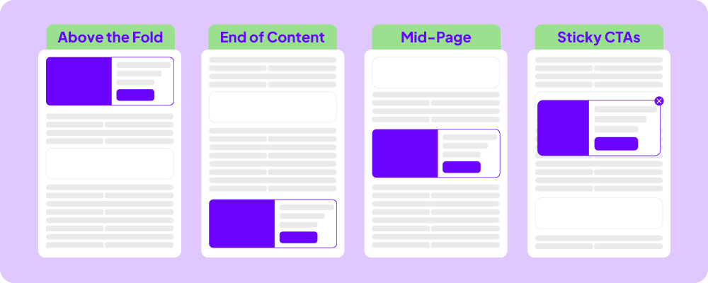
CTA Placement: Where and How to Position for Maximum Impact
Your CTA’s placement can significantly affect its success:
Above the Fold: Place CTAs where visitors can see them immediately.
End of Content: Position CTAs at the end of blog posts or landing pages, where engagement is highest.
Mid-Page: Place CTAs in the middle of long-form content to capture visitors at different stages of their journey.
Sticky CTAs: Floating CTAs that stay visible as users scroll can be effective without being intrusive.
Crafting effective CTAs means understanding psychology, using the right language, and optimizing placement. Implement these strategies to boost conversions and make your website work harder. Ready to take action? Start refining your CTAs today!
Want more tips on boosting your website’s performance? Download our free 2025 Website Guide now for actionable strategies and expert insights.


.svg)