
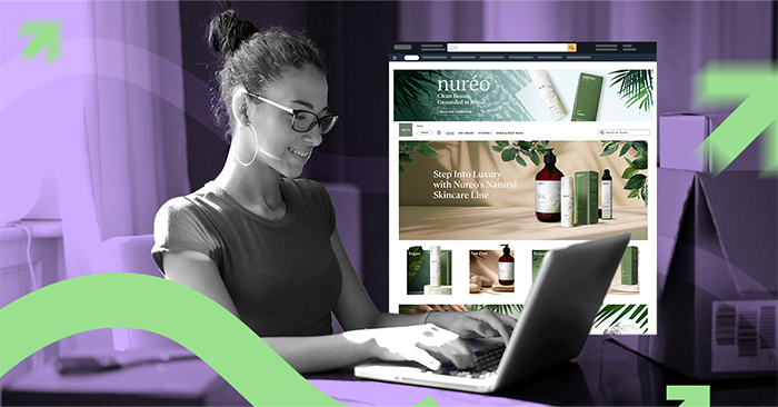
Creating an optimized Amazon storefront is key to increasing brand visibility, boosting trust, and driving sales. A well-designed storefront offers more than just a product showcase—it reflects your brand’s identity, engages customers, and creates a seamless shopping experience. If you’re aiming to improve your storefront or start from scratch, this checklist and guide will walk you through the key elements to make your storefront stand out.
Follow these best practices to ensure your storefront is visually appealing, functional, and optimized for conversions.
When designing your storefront, it’s important to use a mix of tiles that best showcase your brand, products, and unique selling points. While the exact number will vary by business, we recommend using 12-15 tiles. Here are some suggested tile types:
These tiles allow you to tell your brand’s story visually, while also highlighting key products and features.
Your storefront should highlight the most popular or best-selling products in a way that’s visually appealing and aligned with your brand’s core message. Here’s a suggested layout to follow:
By following this structure, you’ll create a more cohesive, compelling experience for your shoppers.
To truly engage visitors, your storefront content needs to be both compelling and relevant. This includes:
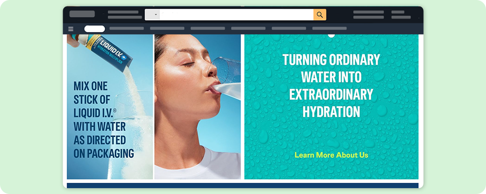
Let’s take a look at Liquid I.V.’s storefront as a strong example of effective design and branding: View Liquid I.V. Storefront
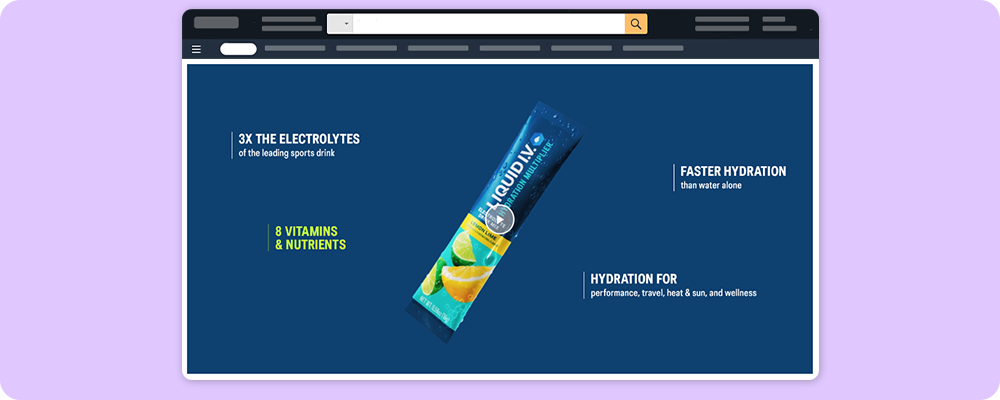
Liquid I.V. immediately communicates its brand focus with bold visuals, bright color palettes, and packaging-forward graphics. Phrases like “Turning Ordinary Water into Extraordinary Hydration” are prominently featured and reinforce the hydration-first promise. The imagery speaks to health-conscious, active lifestyles without overcomplicating the message.
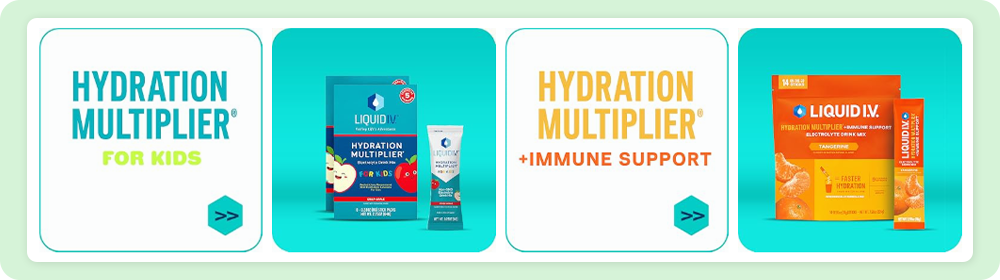
The storefront is structured with a clean and simple layout. Product sections like “Featured products,” “Sugar-Free,” and “Kids” are clearly labeled, making it easy for users to browse by need or category. Each tile leads to a product-focused page with minimal friction.
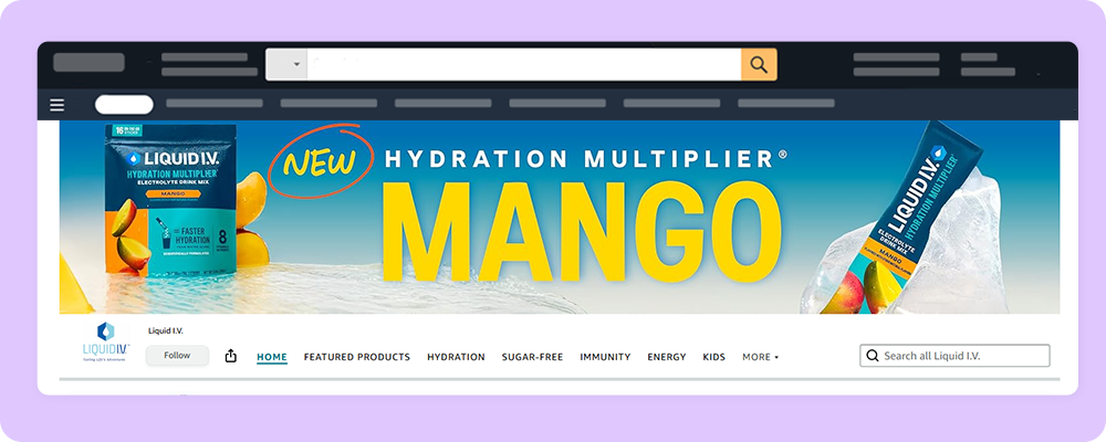
Hero shots feature dynamic water visuals and models mid-drink, instantly tying the product to the use case. While there isn’t much storytelling copy, the visuals imply action, refreshment, and health. The new mango flavor, for example, is promoted with colorful packaging and a vivid, summery backdrop that grabs attention.
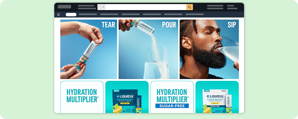
Liquid I.V. uses punchy callouts like “3x the electrolytes,” “8 vitamins & nutrients,” and “Faster hydration than water alone” to quickly communicate value. These benefit-driven headlines act as trust signals, replacing the need for heavy text or technical specs.
The storefront maintains a cohesive look with recurring fonts, iconography, and brand tones across each section. From the layout grid to the droplet icon and color transitions, every design choice feels intentional and aligned with the brand’s visual identity.
To ensure your storefront meets all the best practices, follow this checklist:
By paying attention to these details, you can create an Amazon storefront that stands out, fosters trust, and maximizes conversions.
A well-designed Amazon storefront does more than look good—it builds trust, reflects your brand, and drives conversions. Use the checklist above to ensure every element works toward those goals.
To strengthen your brand story as part of your storefront, check out this article on how to write a compelling Amazon brand story.
Want to go even deeper? Grab our comprehensive guide, “Decoding Your Amazon Storefront. The Workflow Advantage,” for expert strategies, layout planning tips, and content optimization techniques.
Imagine Growth: Get Your Amazon Guide Today, Download Guide
No recruiting, no onboarding, no overhead. Just on-demand creative capacity that grows with your business and adapts to your needs.


.svg)